Bootstrap - CSS Overview
This chapter provides an overview of the key pieces of Bootstrap's infrastructure, including Bootstrap's approach to better, faster, stronger web development.
HTML5 doctype
Bootstrap makes use of certain HTML elements and CSS properties that require the use of the HTML5 doctype. Hence include the below piece of code for HTML5 doctype at the beginning of all your projects using Bootstrap.
<!DOCTYPE html>
<html>
   ....
</html>
Mobile First
Since Bootstrap 3 has been launched, Bootstrap has become mobile first. It means 'mobile first' styles can be found throughout the entire library instead of them in separate files. You need to add the viewport meta tag to the<head> element, to ensure proper rendering and touch zooming on mobile devices.
<meta name = "viewport" content = "width = device-width, initial-scale = 1.0">
- width property controls the width of the device. Setting it to device-width will make sure that it is rendered across various devices (mobiles, desktops, tablets...) properly.
- initial-scale = 1.0 ensures that when loaded, your web page will be rendered at a 1:1 scale, and no zooming will be applied out of the box.
Add user-scalable = no to the content attribute to disable zooming capabilities on mobile devices as shown below. Users are only able to scroll and not zoom with this change, and results in your site feeling a bit more like a native application.
<meta name = "viewport" content = "width = device-width, initial-scale = 1.0, maximum-scale = 1.0, user-scalable = no">
Normally maximum-scale = 1.0 is used along with user-scalable = no. As mentioned above user-scalable = no may give users an experience more like a native app, hence Bootstrap doesn't recommend using this attribute.
Responsive Images
Bootstrap 3 allows you to make the images responsive by adding a class .img-responsive to the <img> tag. This class applies max-width: 100%; andheight: auto; to the image so that it scales nicely to the parent element.
<img src = "..." class = "img-responsive" alt = "Responsive image">
Typography and Links
Bootstrap sets a basic global display (background), typography, and link styles −
- Basic Global display − Sets background-color: #fff; on the <body>element.
- Typography − Uses the @font-family-base, @font-size-base, and@line-height-base attributes as the typographic base.
- Link styles − Sets the global link color via attribute @link-color and apply link underlines only on :hover.
If you intend to use LESS code, you may find all these withinscaffolding.less.
Normalize
Normalize.css is a modern, HTML5-ready alternative to CSS resets. It is a small CSS file that provides better cross-browser consistency in the default styling of HTML elements.
Containers
Use class .container to wrap a page's content and easily center the content's as shown below.
<div class = "container">
   ...
</div>
Take a look at the .container class in bootstrap.css file −
.container {
   padding-right: 15px;
   padding-left: 15px;
   margin-right: auto;
   margin-left: auto;
}
Note that, due to padding and fixed widths, containers are not nestable by default.
Take a look at bootstrap.css file −
@media (min-width: 768px) {
   .container {
      width: 750px;
   }
}
Here you can see that CSS has media-queries for containers with width. This helps for applying responsiveness and within those the container class is modified accordingly to render the grid system properly.
Android - Notifications
A notification is a message you can display to the user outside of your application's normal UI. When you tell the system to issue a notification, it first appears as an icon in the notification area. To see the details of the notification, the user opens the notification drawer. Both the notification area and the notification drawer are system-controlled areas that the user can view at any time.
Android Toast class provides a handy way to show users alerts but problem is that these alerts are not persistent which means alert flashes on the screen for a few seconds and then disappears.
To see the details of the notification, you will have to select the icon which will display notification drawer having detail about the notification. While working with emulator with virtual device, you will have to click and drag down the status bar to expand it which will give you detail as follows. This will be just 64 dp tall and called normal view.
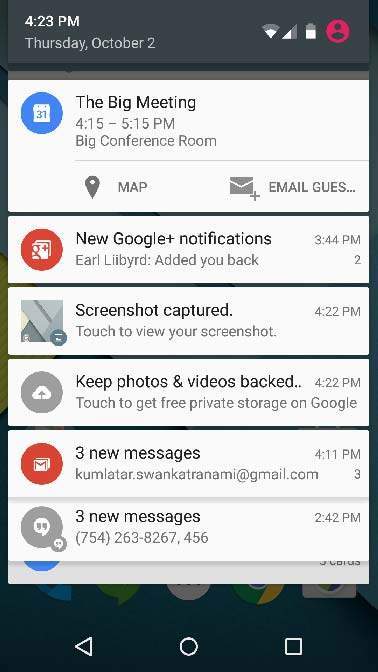
Above expanded form can have a Big View which will have additional detail about the notification. You can add upto six additional lines in the notification. The following screen shot shows such notification.
Create and Send Notifications
You have simple way to create a notification. Follow the following steps in your application to create a notification −
Step 1 - Create Notification Builder
As a first step is to create a notification builder usingNotificationCompat.Builder.build(). You will use Notification Builder to set various Notification properties like its small and large icons, title, priority etc.
NotificationCompat.Builder mBuilder = new NotificationCompat.Builder(this)
Step 2 - Setting Notification Properties
Once you have Builder object, you can set its Notification properties using Builder object as per your requirement. But this is mandatory to set at least following −
- A small icon, set by setSmallIcon()
- A title, set by setContentTitle()
- Detail text, set by setContentText()
mBuilder.setSmallIcon(R.drawable.notification_icon);
mBuilder.setContentTitle("Notification Alert, Click Me!");
mBuilder.setContentText("Hi, This is Android Notification Detail!");
You have plenty of optional properties which you can set for your notification. To learn more about them, see the reference documentation for NotificationCompat.Builder.
Step 3 - Attach Actions
This is an optional part and required if you want to attach an action with the notification. An action allows users to go directly from the notification to anActivity in your application, where they can look at one or more events or do further work.
The action is defined by a PendingIntent containing an Intent that starts an Activity in your application. To associate the PendingIntent with a gesture, call the appropriate method of NotificationCompat.Builder. For example, if you want to start Activity when the user clicks the notification text in the notification drawer, you add the PendingIntent by calling setContentIntent().
A PendingIntent object helps you to perform an action on your applications behalf, often at a later time, without caring of whether or not your application is running.
We take help of stack builder object which will contain an artificial back stack for the started Activity. This ensures that navigating backward from the Activity leads out of your application to the Home screen.
Intent resultIntent = new Intent(this, ResultActivity.class);
TaskStackBuilder stackBuilder = TaskStackBuilder.create(this);
stackBuilder.addParentStack(ResultActivity.class);

// Adds the Intent that starts the Activity to the top of the stack
stackBuilder.addNextIntent(resultIntent);
PendingIntent resultPendingIntent = stackBuilder.getPendingIntent(0,PendingIntent.FLAG_UPDATE_CURRENT);
mBuilder.setContentIntent(resultPendingIntent);
Step 4 - Issue the notification
Finally, you pass the Notification object to the system by calling NotificationManager.notify() to send your notification. Make sure you callNotificationCompat.Builder.build() method on builder object before notifying it. This method combines all of the options that have been set and return a new Notification object.
NotificationManager mNotificationManager = (NotificationManager) getSystemService(Context.NOTIFICATION_SERVICE);

// notificationID allows you to update the notification later on.
mNotificationManager.notify(notificationID, mBuilder.build());
The NotificationCompat.Builder Class
The NotificationCompat.Builder class allows easier control over all the flags, as well as help constructing the typical notification layouts. Following are few important and most frequently used methods available as a part of NotificationCompat.Builder class.
| Sr.No. | Constants & Description |
|---|---|
| 1 | Notification build()
Combine all of the options that have been set and return a new Notification object.
|
| 2 | NotificationCompat.Builder setAutoCancel (boolean autoCancel)
Setting this flag will make it so the notification is automatically canceled when the user clicks it in the panel.
|
| 3 | NotificationCompat.Builder setContent (RemoteViews views)
Supply a custom RemoteViews to use instead of the standard one.
|
| 4 | NotificationCompat.Builder setContentInfo (CharSequence info)
Set the large text at the right-hand side of the notification.
|
| 5 | NotificationCompat.Builder setContentIntent (PendingIntent intent)
Supply a PendingIntent to send when the notification is clicked.
|
| 6 | NotificationCompat.Builder setContentText (CharSequence text)
Set the text (second row) of the notification, in a standard notification.
|
| 7 | NotificationCompat.Builder setContentTitle (CharSequence title)
Set the text (first row) of the notification, in a standard notification.
|
| 8 | NotificationCompat.Builder setDefaults (int defaults)
Set the default notification options that will be used.
|
| 9 | NotificationCompat.Builder setLargeIcon (Bitmap icon)
Set the large icon that is shown in the ticker and notification.
|
| 10 | NotificationCompat.Builder setNumber (int number)
Set the large number at the right-hand side of the notification.
|
| 11 | NotificationCompat.Builder setOngoing (boolean ongoing)
Set whether this is an ongoing notification.
|
| 12 | NotificationCompat.Builder setSmallIcon (int icon)
Set the small icon to use in the notification layouts.
|
| 13 | NotificationCompat.Builder setStyle (NotificationCompat.Style style)
Add a rich notification style to be applied at build time.
|
| 14 | NotificationCompat.Builder setTicker (CharSequence tickerText)
Set the text that is displayed in the status bar when the notification first arrives.
|
| 15 | NotificationCompat.Builder setVibrate (long[] pattern)
Set the vibration pattern to use.
|
| 16 | NotificationCompat.Builder setWhen (long when)
Set the time that the event occurred. Notifications in the panel are sorted by this time.
|
Example
Following example shows the functionality of a Android notification using aNotificationCompat.Builder Class which has been introduced in Android 4.1.
| Step | Description |
|---|---|
| 1 | You will use Android studio IDE to create an Android application and name it as tutorialspoint under a package com.example.notificationdemo. While creating this project, make sure you Target SDK and Compile With at the latest version of Android SDK to use higher levels of APIs. |
| 2 | Modify src/MainActivity.java file and add the code to notify(""), if user click on the button,it will call android notification service. |
| 3 | Create a new Java file src/NotificationView.java, which will be used to display new layout as a part of new activity which will be started when user will click any of the notifications |
| 4 | Modify layout XML file res/layout/activity_main.xml to add Notification button in relative layout. |
| 5 | Create a new layout XML file res/layout/notification.xml. This will be used as layout file for new activity which will start when user will click any of the notifications. |
| 6 | No need to change default string constants. Android studio takes care of default string constants |
| 7 | Run the application to launch Android emulator and verify the result of the changes done in the application. |
Following is the content of the modified main activity filesrc/com.example.notificationdemo/MainActivity.java. This file can include each of the fundamental lifecycle methods.
package com.example.notificationdemo;

import android.app.Notification;
import android.app.NotificationManager;
import android.app.PendingIntent;
import android.content.Intent;
import android.support.v7.app.ActionBarActivity;
import android.os.Bundle;
import android.view.Menu;
import android.view.MenuItem;
import android.view.View;
import android.widget.Button;

public class MainActivity extends ActionBarActivity {
   Button b1;
   @Override
   protected void onCreate(Bundle savedInstanceState) {
      super.onCreate(savedInstanceState);
      setContentView(R.layout.activity_main);

      b1=(Button)findViewById(R.id.button);
      b1.setOnClickListener(new View.OnClickListener() {
         @Override
         public void onClick(View v) {
            Notify("You've received new message");
         }
      });
   }
   private void Notify(String notificationTitle, String notificationMessage){
      NotificationManager notificationManager = (NotificationManager) getSystemService(NOTIFICATION_SERVICE);
      @SuppressWarnings("deprecation")

      Notification notification = new Notification(R.drawable.abc,"New Message", System.currentTimeMillis());
      Intent notificationIntent = new Intent(this,NotificationView.class);
      PendingIntent pendingIntent = PendingIntent.getActivity(this, 0,notificationIntent, 0);

      notification.setLatestEventInfo(MainActivity.this, notificationTitle,notificationMessage, pendingIntent);
      notificationManager.notify(9999, notification);
   }

   @Override
   public boolean onCreateOptionsMenu(Menu menu) {
      // Inflate the menu; this adds items to the action bar if it is present.
      getMenuInflater().inflate(R.menu.menu_main, menu);
      return true;
   }

   @Override
   public boolean onOptionsItemSelected(MenuItem item) {
      // Handle action bar item clicks here. The action bar will
      // automatically handle clicks on the Home/Up button, so long
      // as you specify a parent activity in AndroidManifest.xml.

      int id = item.getItemId();

      //noinspection SimplifiableIfStatement
      if (id == R.id.action_settings) {
         return true;
      }
      return super.onOptionsItemSelected(item);
   }
}
Following will be the content of res/layout/notification.xml file:
<?xml version="1.0" encoding="utf-8"?>
<LinearLayout xmlns:android="http://schemas.android.com/apk/res/android"
   android:orientation="vertical"
   android:layout_width="fill_parent"
   android:layout_height="fill_parent" >

   <TextView
      android:layout_width="fill_parent"
      android:layout_height="400dp"
      android:text="Hi, Your Detailed notification view goes here...." />
</LinearLayout>
Following is the content of the modified main activity filesrc/com.example.notificationdemo/NotificationView.java.
package com.example.notificationdemo;

import android.os.Bundle;
import android.app.Activity;

public class NotificationView extends Activity{
   @Override
   public void onCreate(Bundle savedInstanceState){
      super.onCreate(savedInstanceState);
      setContentView(R.layout.notification);
   }
}
Following will be the content of res/layout/activity_main.xml file −
<RelativeLayout xmlns:android="http://schemas.android.com/apk/res/android"
   xmlns:tools="http://schemas.android.com/tools"
   android:layout_width="match_parent"
   android:layout_height="match_parent"
   android:paddingBottom="@dimen/activity_vertical_margin"
   android:paddingLeft="@dimen/activity_horizontal_margin"
   android:paddingRight="@dimen/activity_horizontal_margin"
   android:paddingTop="@dimen/activity_vertical_margin"
   tools:context="MainActivity">

   <TextView
      android:id="@+id/textView1"
      android:layout_width="wrap_content"
      android:layout_height="wrap_content"
      android:text="Notification Example"
      android:layout_alignParentTop="true"
      android:layout_centerHorizontal="true"
      android:textSize="30dp" />

   <TextView
      android:id="@+id/textView2"
      android:layout_width="wrap_content"
      android:layout_height="wrap_content"
      android:text="Tutorials point "
      android:textColor="#ff87ff09"
      android:textSize="30dp"
      android:layout_below="@+id/textView1"
      android:layout_centerHorizontal="true"
      android:layout_marginTop="48dp" />

   <ImageButton
      android:layout_width="wrap_content"
      android:layout_height="wrap_content"
      android:id="@+id/imageButton"
      android:src="@drawable/abc"
      android:layout_below="@+id/textView2"
      android:layout_centerHorizontal="true"
      android:layout_marginTop="42dp" />

   <Button
      android:layout_width="wrap_content"
      android:layout_height="wrap_content"
      android:text="Notification"
      android:id="@+id/button"
      android:layout_marginTop="62dp"
      android:layout_below="@+id/imageButton"
      android:layout_centerHorizontal="true" />

</RelativeLayout>
Following will be the content of res/values/strings.xml to define two new constants −
<?xml version="1.0" encoding="utf-8"?>
<resources>
   <string name="action_settings">Settings</string>
   <string name="app_name">tutorialspoint </string>
</resources>
Following is the default content of AndroidManifest.xml −
<?xml version="1.0" encoding="utf-8"?>
<manifest xmlns:android="http://schemas.android.com/apk/res/android"
   package="com.example.notificationdemo"
   android:versionCode="1"
   android:versionName="1.0" >

   <application
      android:allowBackup="true"
      android:icon="@drawable/ic_launcher"
      android:label="@string/app_name"
      android:theme="@style/AppTheme" >

      <activity
         android:name="com.example.notificationdemo.MainActivity"
         android:label="@string/app_name" >

         <intent-filter>
            <action android:name="android.intent.action.MAIN" />
            <category android:name="android.intent.category.LAUNCHER" />
         </intent-filter>

      </activity>

      <activity android:name=".NotificationView"
         android:label="Details of notification"
         android:parentActivityName=".MainActivity">
         <meta-data
         android:name="android.support.PARENT_ACTIVITY"
         android:value=".MainActivity"/>
      </activity>

   </application>
</manifest>
Let's try to run your tutorialspoint application. I assume you had created yourAVD while doing environment set-up. To run the APP from Android Studio, open one of your project's activity files and click Run  icon from the toolbar. Android Studio installs the app on your AVD and starts it and if everything is fine with your setup and application, it will display following Emulator window −
icon from the toolbar. Android Studio installs the app on your AVD and starts it and if everything is fine with your setup and application, it will display following Emulator window −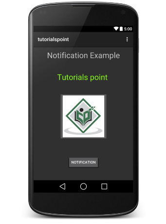
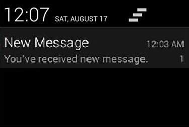
Now click button, you will see at the top a message "New Message Alert!" will display momentarily and after that you will have following screen having a small icon at the top left corner.
Now lets expand the view, long click on the small icon, after a second it will display date information and this is the time when you should drag status bar down without releasing mouse. You will see status bar will expand and you will get following screen −
Big View Notification
The following code snippet demonstrates how to alter the notification created in the previous snippet to use the Inbox big view style. I'm going to update displayNotification() modification method to show this functionality −
protected void displayNotification() {
   Log.i("Start", "notification");

   /* Invoking the default notification service */
   NotificationCompat.Builder  mBuilder = new NotificationCompat.Builder(this);

   mBuilder.setContentTitle("New Message");
   mBuilder.setContentText("You've received new message.");
   mBuilder.setTicker("New Message Alert!");
   mBuilder.setSmallIcon(R.drawable.woman);

   /* Increase notification number every time a new notification arrives */
   mBuilder.setNumber(++numMessages);

   /* Add Big View Specific Configuration */
   NotificationCompat.InboxStyle inboxStyle = new NotificationCompat.InboxStyle();

   String[] events = new String[6];
   events[0] = new String("This is first line....");
   events[1] = new String("This is second line...");
   events[2] = new String("This is third line...");
   events[3] = new String("This is 4th line...");
   events[4] = new String("This is 5th line...");
   events[5] = new String("This is 6th line...");

   // Sets a title for the Inbox style big view
   inboxStyle.setBigContentTitle("Big Title Details:");

   // Moves events into the big view
   for (int i=0; i < events.length; i++) {
      inboxStyle.addLine(events[i]);
   }

   mBuilder.setStyle(inboxStyle);

   /* Creates an explicit intent for an Activity in your app */
   Intent resultIntent = new Intent(this, NotificationView.class);

   TaskStackBuilder stackBuilder = TaskStackBuilder.create(this);
   stackBuilder.addParentStack(NotificationView.class);

   /* Adds the Intent that starts the Activity to the top of the stack */
   stackBuilder.addNextIntent(resultIntent);
   PendingIntent resultPendingIntent =stackBuilder.getPendingIntent(0,PendingIntent.FLAG_UPDATE_CURRENT);

   mBuilder.setContentIntent(resultPendingIntent);
   mNotificationManager = (NotificationManager) getSystemService(Context.NOTIFICATION_SERVICE);

   /* notificationID allows you to update the notification later on. */
   mNotificationManager.notify(notificationID, mBuilder.build());
}
Now if you will try to run your application then you will find following result in expanded form of the view −

Bootstrap - Grid System
What is a Grid?
As put by wikepedia −
In graphic design, a grid is a structure (usually two-dimensional) made up of a series of intersecting straight (vertical, horizontal) lines used to structure the content. It is widely used to design layout and content structure in print design. In web design, it is a very effective method to create a consistent layout rapidly and effectively using HTML and CSS.
To put in simple words, grids in web design organise and structure content, makes the websites easy to scan and reduces the cognitive load on users.
What is Bootstrap Grid System?
As put by the official documentation of Bootstrap for grid system −
Bootstrap includes a responsive, mobile first fluid grid system that appropriately scales up to 12 columns as the device or viewport size increases. It includes predefined classes for easy layout options, as well as powerful mixins for generating more semantic layouts.
Let us understand the above statement. Bootstrap 3 is mobile first in the sense that the code for Bootstrap now starts by targeting smaller screens like mobile devices, tablets, and then “expands” components and grids for larger screens such as laptops, desktops.
Mobile First Strategy
- Content
- Determine what is most important.
- Layout
- Design to smaller widths first.
- Base CSS address mobile device first; media queries address for tablet, desktops.
- Progressive Enhancement
- Add elements as screen size increases.
Working of Bootstrap Grid System
Grid systems are used for creating page layouts through a series of rows and columns that house your content. Here's how the Bootstrap grid system works −
- Rows must be placed within a .container class for proper alignment and padding.
- Use rows to create horizontal groups of columns.
- Content should be placed within the columns, and only columns may be the immediate children of rows.
- Predefined grid classes like .row and .col-xs-4 are available for quickly making grid layouts. LESS mixins can also be used for more semantic layouts.
- Columns create gutters (gaps between column content) via padding. That padding is offset in rows for the first and the last column via negative margin on .rows.
- Grid columns are created by specifying the number of twelve available columns you wish to span. For example, three equal columns would use three .col-xs-4.
Media Queries
Media query is a really fancy term for "conditional CSS rule". It simply applies some CSS, based on certain conditions set forth. If those conditions are met, the style is applied.
Media Queries in Bootstrap allow you to move, show and hide content based on the viewport size. Following media queries are used in LESS files to create the key breakpoints in the Bootstrap grid system.
/* Extra small devices (phones, less than 768px) */
/* No media query since this is the default in Bootstrap */

/* Small devices (tablets, 768px and up) */
@media (min-width: @screen-sm-min) { ... }

/* Medium devices (desktops, 992px and up) */
@media (min-width: @screen-md-min) { ... }

/* Large devices (large desktops, 1200px and up) */
@media (min-width: @screen-lg-min) { ... }
Occasionally these are expanded to include a max-width to limit CSS to a narrower set of devices.
@media (max-width: @screen-xs-max) { ... }
@media (min-width: @screen-sm-min) and (max-width: @screen-sm-max) { ... }
@media (min-width: @screen-md-min) and (max-width: @screen-md-max) { ... }
@media (min-width: @screen-lg-min) { ... }
Media queries have two parts, a device specification and then a size rule. In the above case, the following rule is set −
Let us consider this line −
@media (min-width: @screen-sm-min) and (max-width: @screen-sm-max) { ... }
For all devices no matter what kind with min-width: @screen-sm-min if the width of the screen gets smaller than @screen-sm-max, then do something.
Grid options
The following table summarizes aspects of how Bootstrap grid system works across multiple devices −
| Extra small devices Phones (<768px) | Small devices Tablets (≥768px) | Medium devices Desktops (≥992px) | Large devices Desktops (≥1200px) | |
|---|---|---|---|---|
| Grid behavior | Horizontal at all times | Collapsed to start, horizontal above breakpoints | Collapsed to start, horizontal above breakpoints | Collapsed to start, horizontal above breakpoints |
| Max container width | None (auto) | 750px | 970px | 1170px |
| Class prefix | .col-xs- | .col-sm- | .col-md- | .col-lg- |
| # of columns | 12 | 12 | 12 | 12 |
| Max column width | Auto | 60px | 78px | 95px |
| Gutter width |
30px
(15px on each side of a column)
|
30px
(15px on each side of a column)
|
30px
(15px on each side of a column)
|
30px
(15px on each side of a column)
|
| Nestable | Yes | Yes | Yes | Yes |
| Offsets | Yes | Yes | Yes | Yes |
| Column ordering | Yes | Yes | Yes | Yes |
Basic Grid Structure
Following is basic structure of Bootstrap grid −
<div class = "container">

   <div class = "row">
      <div class = "col-*-*"></div>
      <div class = "col-*-*"></div>
   </div>

   <div class = "row">...</div>

</div>

<div class = "container">
   ....
</div>
Let us see some simple grid examples −
Responsive column resets
With the four tiers of grids available, you are bound to run into issues where at certain breakpoints, the columns don't clear quite right as one is taller than the other. To fix that, use a combination of a class .clearfix and the responsive utility classes as shown in the following example −
<div class = "container">
   <div class = "row" >

      <div class = "col-xs-6 col-sm-3" style = "background-color: #dedef8;
         box-shadow: inset 1px -1px 1px #444, inset -1px 1px 1px #444;">

         <p>Lorem ipsum dolor sit amet, consectetur adipisicing elit.</p>
      </div>

      <div class = "col-xs-6 col-sm-3" style = "background-color: #dedef8;
         box-shadow: inset 1px -1px 1px #444, inset -1px 1px 1px #444;">

         <p>Lorem ipsum dolor sit amet, consectetur adipisicing elit, sed do
            eiusmod tempor incididunt ut labore et dolore magna aliqua. Ut
            enim ad minim veniam, quis nostrud exercitation ullamco laboris
            nisi ut aliquip ex ea commodo consequat.</p>

         <p>Lorem ipsum dolor sit amet, consectetur adipisicing elit, sed do
            eiusmod tempor incididunt ut.</p>
      </div>

      <div class = "clearfix visible-xs"></div>

      <div class = "col-xs-6 col-sm-3" style = "background-color: #dedef8;
         box-shadow: inset 1px -1px 1px #444, inset -1px 1px 1px #444;">

         <p>Ut enim ad minim veniam, quis nostrud exercitation ullamco
            laboris nisi ut aliquip ex ea commodo consequat.</p>
      </div>

      <div class = "col-xs-6 col-sm-3" style = "background-color: #dedef8;
         box-shadow: inset 1px -1px 1px #444, inset -1px 1px 1px #444;">

         <p>Lorem ipsum dolor sit amet, consectetur adipisicing elit, sed do
            eiusmod tempor incididunt ut labore et dolore magna aliqua. Ut
            enim ad minim</p>
      </div>

   </div>
</div>
This will produce the following result −
Lorem ipsum dolor sit amet, consectetur adipisicing elit.
Lorem ipsum dolor sit amet, consectetur adipisicing elit, sed do eiusmod tempor incididunt ut labore et dolore magna aliqua. Ut enim ad minim veniam, quis nostrud exercitation ullamco laboris nisi ut aliquip ex ea commodo consequat.
Lorem ipsum dolor sit amet, consectetur adipisicing elit, sed do eiusmod tempor incididunt ut.
Ut enim ad minim veniam, quis nostrud exercitation ullamco laboris nisi ut aliquip ex ea commodo consequat.
Lorem ipsum dolor sit amet, consectetur adipisicing elit, sed do eiusmod tempor incididunt ut labore et dolore magna aliqua. Ut enim ad minim
Resize your viewport or check it out on your phone for a desired result of this example.
Offset Columns
Offsets are a useful feature for more specialized layouts. They can be used to push columns over for more spacing, (for example). The .col-xs = * classes don’t support offsets, but they are easily replicated by using an empty cell.
To use offsets on large displays, use the .col-md-offset-* classes. These classes increase the left margin of a column by * columns where * range from1 to 11.
In the following example, we have <div class = "col-md-6">..</div>, We will center this using class .col-md-offset-3.
<div class = "container">

   <h1>Hello, world!</h1>

   <div class = "row" >
      <div class = "col-xs-6 col-md-offset-3" style = "background-color: #dedef8;
         box-shadow: inset 1px -1px 1px #444, inset -1px 1px 1px #444;">

         <p>Lorem ipsum dolor sit amet, consectetur adipisicing elit.</p>
      </div>

   </div>

</div>
This will produce the following result −
Lorem ipsum dolor sit amet, consectetur adipisicing elit.
Nesting columns
To nest your content with the default grid, add a new .row and set of .col-md-* columns within an existing .col-md-* column. Nested rows should include a set of columns that add up to 12.
In the following example, the layout has two columns, with the second one being split into four boxes over two rows.
<div class = "container">
   <h1>Hello, world!</h1>

   <div class = "row">

      <div class = "col-md-3" style = "background-color: #dedef8;
         box-shadow: inset 1px -1px 1px #444, inset -1px 1px 1px #444;">

         <h4>First Column</h4>
         <p>Lorem ipsum dolor sit amet, consectetur adipisicing elit.</p>
      </div>

      <div class = "col-md-9" style = "background-color: #dedef8;
         box-shadow: inset 1px -1px 1px #444, inset -1px 1px 1px #444;">

         <h4>Second Column- Split into 4 boxes</h4>
         <div class = "row">

            <div class = "col-md-6" style = "background-color: #B18904;
               box-shadow: inset 1px -1px 1px #444, inset -1px 1px 1px #444;">

               <p>Consectetur art party Tonx culpa semiotics.
                  Pinterest assumenda minim organic quis.</p>
            </div>

            <div class = "col-md-6" style = "background-color: #B18904;
               box-shadow: inset 1px -1px 1px #444, inset -1px 1px 1px #444;">

               <p>sed do eiusmod tempor incididunt ut labore et dolore magna
                  aliqua. Ut enim ad minim veniam, quis nostrud exercitation
                  ullamco laboris nisi ut aliquip ex ea commodo consequat.</p>
            </div>

         </div>

         <div class = "row">

            <div class = "col-md-6" style = "background-color: #B18904;
               box-shadow: inset 1px -1px 1px #444, inset -1px 1px 1px #444;">

               <p>quis nostrud exercitation ullamco laboris nisi ut aliquip
                  ex ea commodo consequat.</p>
            </div>

            <div class = "col-md-6" style = "background-color: #B18904;
               box-shadow: inset 1px -1px 1px #444, inset -1px 1px 1px #444;">

               <p>Lorem ipsum dolor sit amet, consectetur adipisicing elit,
                  sed do eiusmod tempor incididunt ut labore et dolore magna
                  aliqua. Ut enim ad minim.</p>
            </div>

         </div>

      </div>

   </div>

</div>
This will produce the following result −
First Column
Lorem ipsum dolor sit amet, consectetur adipisicing elit.
Second Column- Split into 4 boxes
Consectetur art party Tonx culpa semiotics. Pinterest assumenda minim organic quis.
sed do eiusmod tempor incididunt ut labore et dolore magna aliqua. Ut enim ad minim veniam, quis nostrud exercitation ullamco laboris nisi ut aliquip ex ea commodo consequat.
quis nostrud exercitation ullamco laboris nisi ut aliquip ex ea commodo consequat.
Lorem ipsum dolor sit amet, consectetur adipisicing elit, sed do eiusmod tempor incididunt ut labore et dolore magna aliqua. Ut enim ad minim.
Column Ordering
Another nice feature of Bootstrap grid system is that you can easily write the columns in an order, and show them in another one. You can easily change the order of built-in grid columns with .col-md-push-* and .col-md-pull-*modifier classes where * range from 1 to 11.
In the following example we have two columns layout with left column being the narrowest and acting as a sidebar. We will swap the order of these columns using .col-md-push-* and .col-md-pull-* classes.
<div class = "container">
   <h1>Hello, world!</h1>

   <div class = "row">
      <p>Before Ordering</p>

      <div class = "col-md-4" style = "background-color: #dedef8;
         box-shadow: inset 1px -1px 1px #444, inset -1px 1px 1px #444;">

         I am on left
      </div>

      <div class = "col-md-8" style = "background-color: #dedef8;
         box-shadow: inset 1px -1px 1px #444, inset -1px 1px 1px #444;">

         I am on right
      </div>

   </div>

   <br>

   <div class = "row">
      <p>After Ordering</p>

      <div class = "col-md-4 col-md-push-8" style = "background-color: #dedef8;
         box-shadow: inset 1px -1px 1px #444, inset -1px 1px 1px #444;">

         I was on left
      </div>

      <div class = "col-md-8 col-md-pull-4" style = "background-color: #dedef8;
         box-shadow: inset 1px -1px 1px #444, inset -1px 1px 1px #444;">

         I was on right
      </div>

   </div>

</div>
This will produce the following result −
Hello, world!
Before Ordering
I am on left
I am on right
After Ordering
I was on left
I was on right
Subscribe to:
Posts (Atom)

